Wednesday, December 3, 2014

(PROGRESSIVE PLACEHOLDER / STATEMENT UPDATE): Curatorial Change

I've been making concerning changes to my curatorial statement to make it less vague & less cliche (NOTE: This change is still NOT complete, hence placeholder. This will be updated again)
---------------------------------------------------------------------------------------------------------------------
Data
Name: Ryan Cook
Exhibition Name: “Anthropomorphic Equilibrium”
Type: Gallery of arts from visual artists
Date: December 2014

Theme
The central theme that I decided would be Symbiosis: Human Environment (but not limited to only people and nature).

Anthropy

Humans need to have fantasies to be human.”
Humankind cannot gain something without giving something in return in equal value.”

3 Artists (2 from ART 21 / Textbook, 1 of your own choosing)
ART 21: Sally Mann (from ART 21)
TEXTBOOK: (CHANGED CHOICE)--> Jeff Koons
CUSTOM: Yoshitaka Amano (custom choice)

Curatorial Statement
The exhibition of Anthropomorphic Equilibrium is the place for works of art that invokes the general theme of human environment made by selected few artists of the host's choice. In the gallery, the mediums of art are diverse but centralize under the involvement of natural environments and people (including creatures with human characteristics). In the works, both realistic and low-fantasy subject matters are involved. The works are each and every different in form and technique process, but the underlying theme is approximately the same. The anthropological focus of human kind is ever present here, where areas made by the environments and the people involved play a vital role. It's important to realize the key to survival, appreciation, and immersion upon complex reasons that interactive life forms make, and that's mainly what the exhibition's motive is for.

Sally Mann (born May 1, 1951 (age 63)
A photographer that manages with arduous but authentic techniques about mostly colorless portraits of people & the outdoor setting. Children, outdoor natures, & old houses are involved. Her use of lighting and coloring choices represent a historical and haunting aura that justifies the notion of life and death.
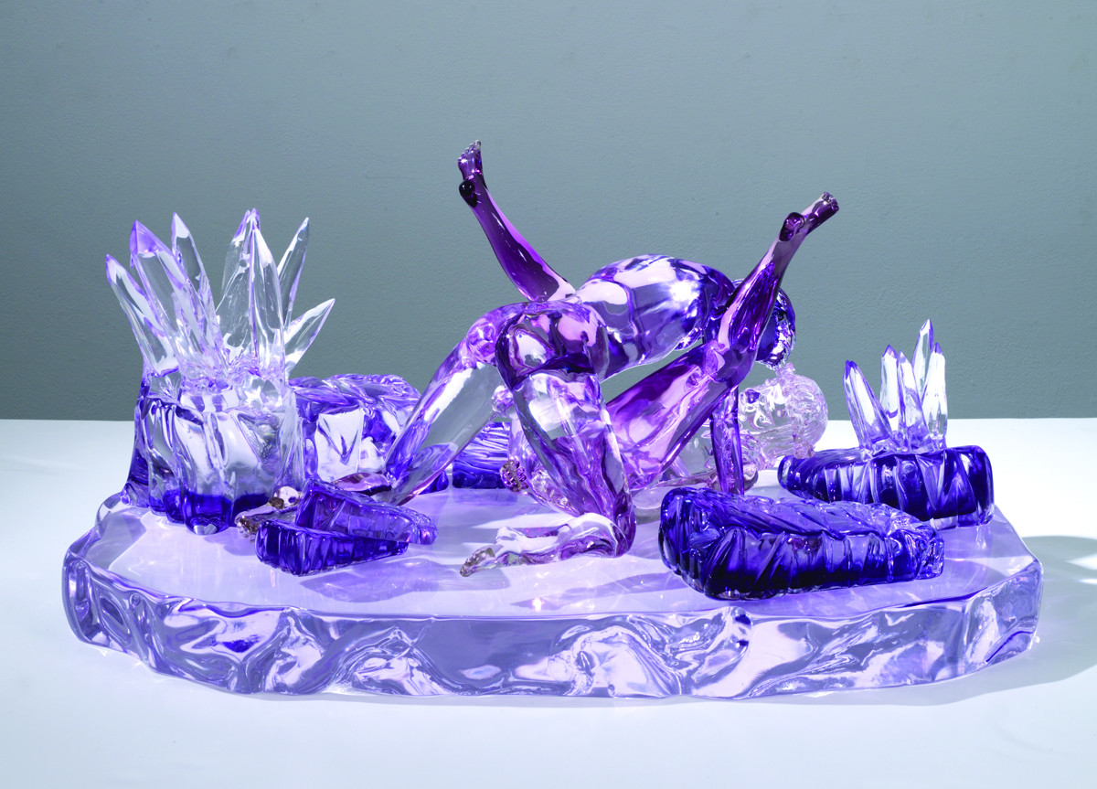
Jeffery “Jeff” Koons (born January 21, 1955 ) is a varied artist in both the 2D and 3D formations of his creations. The variety is high, from working in anthropomorphic materials of balloons, kitsch scraps, and technological parts, to paintings, 2D collages turned into formulated figures, and colorful 3D models. The use of allegorical display of animals, humans, and anthropomorphic creatures is taken to an iconic content made from what was once unimportant parts of materials into something profound and subliminally phenomenal. The creative attitude of using colors, psychological directions into intense shifts and drastic sizes, and wholeheartedly accepting determination to use anything and everything are all prevalent here.

Yoshitaka Amano (born in Shizuoka City, Japan on July 28, 1952 ) is a Japanese painter on both original (general) and for video game artworks. Using complex but elegant techniques with watercolor, his visual works are of wisp and wonder. Most of his works rely on dream-like coloring, peculiar fantasy environments, and creative scenarios among character designs and still-picture interactions.

With all the artist's works in place, the significant factor of human nature and its environment to be linked by interaction and acts of nature are ever-present in both entertainment and the real world itself. More importantly, it helps to get a clear understanding even in an artistic, creative, and enjoyable sense in order to appreciate and accept the very true messages of reality even in films, shows, games, and books. Enjoy your observation to the works, as everything is bounded, and everyone is connected.
http://www.pbs.org/art21/artists/sally-mann
http://www.pbs.org/art21/artists/jeff-koons
http://amano-artwork.tumblr.com/


Images of artworks from each artist (visual art examples)

A work from Sally Mann

Works from Jeff Koons


Works from Yoshitaka Amano

Monday, December 1, 2014

Exhibition Curatorial Statement and Decided Information

Data
Name: Ryan Cook
Exhibition Name: “Anthropomorphic Equilibrium”
Type: Gallery of arts from visual artists
Date: December 2014

Theme
The central theme that I decided would be Human Environment (but not limited to only people and nature).

Anthropy

Humans need to have fantasies to be human.”
Humankind cannot gain something without giving something in return in equal value.”

3 Artists (2 from ART 21 / Textbook, 1 of your own choosing)
Sally Mann (from ART 21)
Mark Dion (also available in ART 21)
Yoshitaka Amano (custom choice)

Curatorial Statement
The exhibition of Anthropomorphic Equilibrium is the place for works of art that invokes the general theme of human environment made by selected few artists of the host's choice. In the gallery, the mediums of art are diverse but centralize under the involvement of natural environments and people (including creatures with human characteristics). In the works, both realistic and low-fantasy subject matters are involved. The works are each and every different in form and technique process, but the underlying theme is approximately the same. The anthropological focus of human kind is ever present here, where areas made by the environments and the people involved play a vital role. It's important to realize the key to survival, appreciation, and immersion upon complex reasons that interactive life forms make, and that's mainly what the exhibition's motive is for.

Sally Mann is a photographer that manages with arduous but authentic techniques about mostly colorless portraits of people and the outdoor setting. Her use of lighting and coloring choices represent a historical and haunting aura that justifies the notion of life and death. Mark Dion loosely combines science and art as one in an intelligent formation focusing on the dominant ideologies about the very nature of humanity, history, knowledge, and the natural world. His works are physical installments and made objects that represent those sub-themes, which are artifact-like. Yoshitaka Amano is a Japanese painter on both original (general) and for video game artworks. Using complex but elegant techniques with watercolor, his visual works are of wisp and wonder. Most of his works rely on dream-like coloring, peculiar fantasy environments, and creative scenarios among character designs and still-picture interactions.


With all the artist's works in place, the significant factor of human nature and its environment to be linked by interaction and acts of nature are ever-present in both entertainment and the real world itself. More importantly, it helps to get a clear understanding even in an artistic, creative, and enjoyable sense in order to appreciate and accept the very true messages of reality even in films, shows, games, and books. Enjoy your observation to the works, as everything is bounded, and everyone is connected.

LINKS OF THEIR WORKS:
http://www.pbs.org/art21/artists/sally-mann
http://www.pbs.org/art21/artists/mark-dion
http://amano-artwork.tumblr.com/


Images of artworks from each artist (visual art examples)

A work from Sally Mann

A work from Mark Dion


A work from Yoshitaka Amano

Monday, November 24, 2014

Reading Assignment (Measuring Success), PSA Reflection

PSA Reflection (Mine: "Death by Academics & Asian Education Suicide Epidemic)

     So I decided to finally (and more than infinitely overdue) do a reflection based on the most recent project we finished. I liked how we were able to design the project poster based on our own creativity and methods of creating while following the basic template and formatting policies of a Public Service Announcement poster. I took pictures of the hanged ones in the Rowe Hall 2nd Floor first, and then the Winningham 2F entries second. Most of them looked alright, some are spot-on. I will say that as much as I could have done far better on mine, I'm glad to know that it didn't have to be glossed since mine was printed out of thick paper, not gloss paper. Even so, some people don't prefer gloss, so it's good that I did what I needed to do. Furthermore, I've come to find out on a side-note that my poster is apparently by far the darkest and most hauntingly serious poster of them all within the class at least. (Most of the others are negative but reasonable, moderate, or lighthearted/silly/funny)

Betsy Damon
Reading about her, the basic gist that I got out of her that remained in the front of my mind, was that she is isn't all about herself it itself as an individual. It's all about her arts and not her. That being said, she takes interest in nature, like vast domains of earth, water, and air. This is especially evoking to the fact that she makes artistic interconnections between aquatic life, plant life, and the lives of all 9 Million citizens of Chengdu, China. She says "The Chengdu project is an extension of my philosophy of what it takes to live on the planet, the necessity of working together, bringing together unlikely partners, and forming new relationships." This continues forth, and so does her pursuit for making artworks and physical projects of that nature.

Betsy honors the beauty of water on a sale that includes the delicate minutiae of its molecules. It's more than aesthetics, but also sustaining health of all living beings. She even considers this to return the contaminated condition to its original, peacefully & positively purified state.

Xu Bing
I took note of this artist in my mind to expect differences. He suggests a different source from human thought being a limited potential. Xu Bing says that as a way of thinking otherwise, and ultimately, outside of the box. Sometimes beliefs and awareness can create confusion, is what he mentioned. They erode dependence on written words, and the keyword of his subject matters involve "dependence." He doubts that authentic cultures dwell on physical manifestations within. The system of interactions, dependence, and individual distinguishing things is crucial and integral; this goes for both natural matters and artificial / social matters.

Daniel Joseph Martinez
(already read, self-explanatory from previous Blog entries)


Michelle Lopez
Born in 1970 in the Phillipines, Lopez encounters the artistic subject matters via the method of carefully attending to the checks and balance between her efforts and her rewards. Highest potential being obtained would be compromised if these aspects of success is not balanced nor equal to each other. Too much effort for too little reward, or too-good-to-be-true reward from suspiciously little efforts produce frustration and potential damage, both psychologically and by situation. That said, it's necessary to be watchful, and that's what she projects from both doing her arts and the artworks themselves of her creations and themes.

Matthew Barney
His arts are made with the tool kit of not only paint, brush, turpentine, and rags, but also does for choreographers, production teams, digital animators, film editors, makeup artist, hair stylists, composers, sound designers, editors, administrative assistants, fabricators, production assistants, and others...etc.

We can tell this artist puts maximalism and adding "bells and whistles" to its finest. His arts imply that resistance implies interference. With his installments and advanced artworks at hand, this is evidence that his themes are relatively similar to above artists but stand diversely on its own as well.

Monday, November 17, 2014

Friday, November 14, 2014

Update: Art21, Artists', Project, Reflection, Notes, etc.

On November 3 (Mon): On this day, we gathered into our mini-groups to talk a bit about the ART 21 based off its videos, contents, arts, and whereabouts. There really wasn't much I could say about it, but it was a variety of ways to show styles and graphical techniques about propaganda, political posters, etc., that and Sans Serif & Helvetica to be reminded of.

We then went to show our proposals within our groups to discuss plans and versions of our sketches as an idea of our posters. I drew a couple of versions (sequentially, I do build-up versions of the following: Pre-α, α, ß, δ, & Final. Any additional pre-final & post-final build ups can include: π, σ, µ, τ, φ, ε; then post-finals: ∩, Σ, Ω, & ∞+) and each of them are supposed to be progressively better and more effective. Apparently, my poster message is intense & scary.

On November 5 (Wed): At the time of this day, there was no class. I was busy doing artwork for both the poster and traditional hand-drawn artwork all day until sundown for my best friend's birthday for that Saturday (Nov 8). It was a busy but well-felt day due to such accomplishments met from hard work and then rest. Even so, I like being productive that way. My old tablet already broke down for good the day right before that, so I had to draw the pre-final posters in hand-drawn type.

On November 6 (Thu): A few more things had to be analyzed and developed further with the poster project. I have the technology, and I eventually had to use my printer/fax/scanner device by scanning for the first time and worked quite well. I'll have to hurry to finish it all.

On November 11 (Tue): On Mon, Nov 10, we presented our 8.5x11" sheet images and took notes of each other's works, and then we made a critical analysis of our updated versions on Wed, Nov 12, 2014. This day in-between, I managed to update it without needing to use a tablet since Photoshop CS6 Extended has a lot of options to edit even only using a mouse. Amazing, isn't it?

Textbook/Content Notes:
Introduction: Choosing a Mission:
When looking to this particular section, the author of this segment talks about the concept of "establishing an artistic mission has become a matter of self-determination." This would mean that this mission can be very different for any and every single artist, which can also be chosen or discovered upon different means. The reading of this section felt reminiscent about my mission to revitalize my artworks and improve that and myself as immensely as possible. I hope to become an unparalleled video game, film, TV, & novel/(comic)book (concept)artist

Sketchbook Notes:

Design Poster: Political Public Announcement style
(print something, spend money)

Select & Come up with a Central Theme & Message.
-->Get the message across quickly; clean, precise, to-the-point, concise/not wordy, original, and unique. (Final: 18"x 24") (Note: Add company, & support logos) Image & Text

LIST OF CHOICES & POLITICAL THEMES (Warning: Dark Topics+Controversy):
Korean / Asian Suicide by Academics & Societal Perfectionism *(CHOSEN)
Child & Teen Sex & Pregnancy + Pornography (Including infants & brutal rape)
Animal Abuse & Child Labor / Slavery & Selling (especially in Asia)
Nuclear & potentially Apocalyptic Issues especially in Ukraine
(Hint: 1986 Chernobyl Meltdown!!), Japan Radiation (March 2011 Earthquake after effect), & WWIII.
Domestic Violence & an era of fallen marriages, short-term relationships, and death by love.
Japanese population decline from underrated breeding and infrequent connect + high-isolation.
US Education System Downfall(vs. Finland (#1, lenient+co-op) vs. Asia (Insane, competitive)
Mexican Cartel Insanity + Asylum Abundance rise, Drug/Psychological Abuse, Snuff, Terror+
Phillipines Crime & Country Poverty(development struggles)+hypocrisy, drama, & psychosi
s
*Write what strikes you about the artists/art world (Mission as an artist)

People who draw anthropomorphic animals and deeply personified life forms intrigue me. I do the same, even if I am better at backgrounds, scenery, environments, concepts, landscapes, and objects than characters & human(oid)s

*Discuss technique/technology (Self-fulfillment or generosity?)

I use both old-fashioned and digital techniques/technology, whether mixed or separately (preferred). I go with self-fulfillment, but to those I know dearly, I'd be more than happy to be generous especially to those I can love.

*Working with community (Advocate? Awareness? Individual? Shared?)

No, I'd rather be as individualistic and isolated as possible while working with a studio with a group of people.
Advocate? Doesn't matter who. Awareness? It depends on the direct impact & relevancy+location. Individual? Yes, beyond the utmost extreme. Shared? It depends, but I share & collaborate to only those I trust exceptionally.

--------------------------------------------

Back-up Poster Themes: Infant Rape & Pedophilia / Asylum & Apocalypse

2nd Back-up: "Furry" Subculture Uprise

(Note: Since the first idea (KOREAN/ASIA ACADEMIC DEATH & WORLDWIDE SUICIDE EPIDEMIC BY SCHOOL WORK) has already been nearly finished entirely, it won't be necessary to do the 1st & 2nd back-up)

ALSO: For November 17, 2014 (Mon): Work on POWERPOINT (Final)
5 minutes (or less) of real-time presentation: Intent, Process, Research, Action (+content), Final Hanging+Digital


Extra Notes:
Artists': Laylah Al. (Gouache paint/dauce), Krzyztof Wodiczko (video projection), Alfredo Jaar (plants/wind), Jenny Holzer (miscellaneous)
------

I'll have to finish digital-drawing and finalizing the poster + print settings, write the powerpoint informational document, then go to STORRS to large-print it clearly & cleanly, ready to submit+present it Monday, November 17, 2014 C.E.@12:00pmGMT-5,DST=OFF.

Monday, November 3, 2014

November Log: Artists' Reading, ART 21, My Topic (Korean Student Suicide & Death Epidemic), Images of, Likes/Dislikes, Site Sources, etc.

Project Ideas & Research Evidence:
I strictly decided to do a hopefully-refreshing theme: Korean(and all of Asia) academic student suicide & epidemic death

I should be able to plan out EXACTLY how the final image in mind should look like when I design it in Corel Painter XIII, Manga Studio 5 EX, & Adobe Photoshop CS6 Extended (+Portable if need be). My likes about this is how I'll design it and the sheer intensity of the message, but my high-hate about it is how it's always in Asia
You can find my link of the various videos and researches I've done (especially for the past years I've been learning in desire about it) here:

https://www.youtube.com/playlist?list=PLCPDlPTSV8IEXJIGllHPdO8UjxHKD97DH

http://www.koreanhighschool.com/

http://en.wikipedia.org/wiki/Education_in_South_Korea

http://qz.com/244448/what-south-korean-high-school-students-carry-in-their-backpacks-may-surprise-you/

http://asiasociety.org/education/learning-world/south-korean-education%20

https://www.youtube.com/watch?v=hI-wCYzV8xs

https://www.google.com/search?q=korean+school+suicide&oq=korean+school+suicide&aqs=chrome..69i57j0j69i65j0l3.3686j0j7&sourceid=chrome&es_sm=122&ie=UTF-8

http://www.aljazeera.com/indepth/features/2013/12/south-korean-students-wracked-with-stress-201312884628494144.html

http://dish.andrewsullivan.com/2014/04/22/suicide-in-south-korea/

http://blogs.wsj.com/korearealtime/2014/03/20/poll-shows-half-of-korean-teenagers-have-suicidal-thoughts/

http://www.salon.com/2014/03/15/why_is_suicide_so_popular_in_south_korea_partner/

http://www.huffingtonpost.com/2011/04/15/student-suicides-lead-to-_n_849541.html


Artists' Reading:
Alfredo Jaar: An artist who integrates his backgrounds into his artworks as the core focus, the majority of his primary attractions cater to the Spanish-speaking culture due to the fact that his intentions are to project the message across directly just for them. Alfredo is from Chile, which explains as such but that is also all there is to it. To be frank, I've already set a clear-enough vision of what kinds of artworks I make to have my works appeal to, but it's still a young and underdeveloped vision nonetheless. Mainly, I would want to appeal my art to many video gamers, animal lovers, fantasy lovers, sci-fi adorers, surrealists, nature appreciators, etc.

Even so, this is a fitting and enticing artist I'd like to know more about while painting sincerely. Jaar has stated that all of his works come in synergy to beauty, since life is nothing without beauty, he says. Because we are doing posters that mostly project terrifying and negative messages, it would only be incorporating beauty if it's made neatly, or if the sense of hope underneath a devastating message in the end is invoked really well. Either way, there are shadow-steps of his works that are reminiscent to Helvetica, the video we watched in class last week, and it is all the more reason to catch our paradigm upon the gambit of graphic design. I know what to do with this project, but I'll need to put forth more evidence to my work especially to this Blog before I actually design the poster. I already have the theme decided.


Layla Alf: Reading the works of this artist, I found a few interesting things that I have come to catch notice about this artist and the works of such, and that would be the way she uses her instances from her child past in order to create many of her paintings, and every one of it. She even says that she's been avid for cartoons when she was very young (me too!), and that the game of dodge-ball and the conflict upon racism had a massive hit on her experiences back in the day. I would speculate this would be a nice idea to do a graphic design for a project as a back-up plan for the theme and putting in fresh new sub-idea relating to the central theme. (That is, if I have enough spare time to do the extra (fun) work between now and November 16, 2014 (the day right before the due date)). As much as I STRONGLY resent against my family members, sans that of dad due to trust & closeness, I can only relate fondly to this artist in terms of childhood memories that do not relate to my family much at all. In sheer spite of this, Sue Coe is quite the similar determined artist to Layla, as they put their beliefs in stronghold to both the direction and execution to the artworks they create. The works of Alf are also not afraid to come out brutally with the underlying theme of slavery, akin to that of Kara Walker's works. Upon everything to it, I loved cartoons of the classic, and her methods are respectable. I do like neat and clean as long as it does not compromise detail and elegance in any way at all. I want to see if I can put forth my art and message in superbly sheer grittiness and detail in the most cleanest and strongest of manners.

Daniel Joseph Martinez: Daniel is an American artist of Los Angeles, in which he puts central thematic on utilizing text in an array of ways and forms of media, especially installation, prints, sculpture, poster design, and so forth . . . much of his works are often always politically-focused, and other works focus solely on asking controversial (but necessary) questions. That being said, I commend his works in that form as activism and logical endeavor, while his exhibits in general, overall, are perhaps more enticing than his individual works of art. His shrine of prints in his exhibits fused together along with his installations create an almost-entirely invigorating space and atmosphere to the experience. Much of his pieces along are a bit challenging to delve yourself in with enjoyment, so many other artists' works that contain text create more visually appealing forms upon design. Still, it's mostly the content and function that counts, not purely the looks and fashion; substance over style is what I'd rather have than the other way around if I could not have both equally.

ART 21: Krzysztof Wodiczko & Jenny Holzer
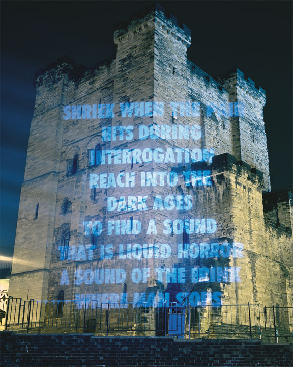
ART 21 Artist 1: Jenny Holzer, born in Gallipolis, Ohio, 1950 A.D / C.E. Much of her works, akin to Wodiczko's, projects the perspective of others on gargantuan monuments as well. However, rather than an actual video, Jenny uses texts for us audiences to read, though all of it has been anonymously written about political and social issues. Who wrote these?

In any case, I discovered and noticed that some of it was mundane and overused, however I did learn that common people of the daily life had written it, so it's easily relating even to me. The intention to this was to invoke a strong sympathy and ease of understanding, and it does. With the opinions and statements provoked on massive buildings, it's easy to notice, and they actually create the notion of citizens shrieking & howling their concerns at governments, big businesses, industries, and many magnitudes of incorporation & franchises. They are not only explicit, but excellent on the eyes. That way, their text can correlate and force vision on large structures, that of which is strikingly astonishing.
Images of her works are shown here:




ART 21 Artist 2: Krzysztof Wodiczko, who was born in Warsaw, Poland, 1943 C.E / A.D. He later then moved to the United States, and now resided in NY and MA (Massachusetts). Known for his installations & performance piece where he projects recording of people telling personal stores on huge monuments, often times, the stories are about gang-related violence and/or losing loved ones due to mass political situations and outbreak. Wodiczko desires for his works of art to remind people that the great-and-powerful monuments we gaze on a daily basis are relatively hiding the horrific iceburg-bottom of civilization and society entirely.

That being said, I find his works to be nothing new in the general theme of things, but it's still highly awe-inspiring due to the unique way he pulls it off. Even though some of his piece are respectfully old, the concept is timeless in essence. Even with the projectors, holograph devices, and newer technology we can represent his works with, the effects are always ever changing in all the better ways with the same "monster" formed by the ultra-real nightmare we call society. We could very well be in WWIII + Nuclear Wars on crack, combined soon!!
Here are images of his various works: