I strictly decided to do a hopefully-refreshing theme: Korean(and all of Asia) academic student suicide & epidemic death
I should be able to plan out EXACTLY how the final image in mind should look like when I design it in Corel Painter XIII, Manga Studio 5 EX, & Adobe Photoshop CS6 Extended (+Portable if need be). My likes about this is how I'll design it and the sheer intensity of the message, but my high-hate about it is how it's always in Asia
You can find my link of the various videos and researches I've done (especially for the past years I've been learning in desire about it) here:
https://www.youtube.com/playlist?list=PLCPDlPTSV8IEXJIGllHPdO8UjxHKD97DH
http://www.koreanhighschool.com/
http://en.wikipedia.org/wiki/Education_in_South_Korea
http://qz.com/244448/what-south-korean-high-school-students-carry-in-their-backpacks-may-surprise-you/
http://asiasociety.org/education/learning-world/south-korean-education%20
https://www.youtube.com/watch?v=hI-wCYzV8xs
https://www.google.com/search?q=korean+school+suicide&oq=korean+school+suicide&aqs=chrome..69i57j0j69i65j0l3.3686j0j7&sourceid=chrome&es_sm=122&ie=UTF-8
http://www.aljazeera.com/indepth/features/2013/12/south-korean-students-wracked-with-stress-201312884628494144.html
http://dish.andrewsullivan.com/2014/04/22/suicide-in-south-korea/
http://blogs.wsj.com/korearealtime/2014/03/20/poll-shows-half-of-korean-teenagers-have-suicidal-thoughts/
http://www.salon.com/2014/03/15/why_is_suicide_so_popular_in_south_korea_partner/
http://www.huffingtonpost.com/2011/04/15/student-suicides-lead-to-_n_849541.html
Artists' Reading:
Alfredo Jaar: An artist who integrates his backgrounds into his artworks as the core focus, the majority of his primary attractions cater to the Spanish-speaking culture due to the fact that his intentions are to project the message across directly just for them. Alfredo is from Chile, which explains as such but that is also all there is to it. To be frank, I've already set a clear-enough vision of what kinds of artworks I make to have my works appeal to, but it's still a young and underdeveloped vision nonetheless. Mainly, I would want to appeal my art to many video gamers, animal lovers, fantasy lovers, sci-fi adorers, surrealists, nature appreciators, etc.
Even so, this is a fitting and enticing artist I'd like to know more about while painting sincerely. Jaar has stated that all of his works come in synergy to beauty, since life is nothing without beauty, he says. Because we are doing posters that mostly project terrifying and negative messages, it would only be incorporating beauty if it's made neatly, or if the sense of hope underneath a devastating message in the end is invoked really well. Either way, there are shadow-steps of his works that are reminiscent to Helvetica, the video we watched in class last week, and it is all the more reason to catch our paradigm upon the gambit of graphic design. I know what to do with this project, but I'll need to put forth more evidence to my work especially to this Blog before I actually design the poster. I already have the theme decided.
Layla Alf: Reading the works of this artist, I found a few interesting things that I have come to catch notice about this artist and the works of such, and that would be the way she uses her instances from her child past in order to create many of her paintings, and every one of it. She even says that she's been avid for cartoons when she was very young (me too!), and that the game of dodge-ball and the conflict upon racism had a massive hit on her experiences back in the day. I would speculate this would be a nice idea to do a graphic design for a project as a back-up plan for the theme and putting in fresh new sub-idea relating to the central theme. (That is, if I have enough spare time to do the extra (fun) work between now and November 16, 2014 (the day right before the due date)). As much as I STRONGLY resent against my family members, sans that of dad due to trust & closeness, I can only relate fondly to this artist in terms of childhood memories that do not relate to my family much at all. In sheer spite of this, Sue Coe is quite the similar determined artist to Layla, as they put their beliefs in stronghold to both the direction and execution to the artworks they create. The works of Alf are also not afraid to come out brutally with the underlying theme of slavery, akin to that of Kara Walker's works. Upon everything to it, I loved cartoons of the classic, and her methods are respectable. I do like neat and clean as long as it does not compromise detail and elegance in any way at all. I want to see if I can put forth my art and message in superbly sheer grittiness and detail in the most cleanest and strongest of manners.
Daniel Joseph Martinez: Daniel is an American artist of Los Angeles, in which he puts central thematic on utilizing text in an array of ways and forms of media, especially installation, prints, sculpture, poster design, and so forth . . . much of his works are often always politically-focused, and other works focus solely on asking controversial (but necessary) questions. That being said, I commend his works in that form as activism and logical endeavor, while his exhibits in general, overall, are perhaps more enticing than his individual works of art. His shrine of prints in his exhibits fused together along with his installations create an almost-entirely invigorating space and atmosphere to the experience. Much of his pieces along are a bit challenging to delve yourself in with enjoyment, so many other artists' works that contain text create more visually appealing forms upon design. Still, it's mostly the content and function that counts, not purely the looks and fashion; substance over style is what I'd rather have than the other way around if I could not have both equally.
ART 21: Krzysztof Wodiczko & Jenny Holzer
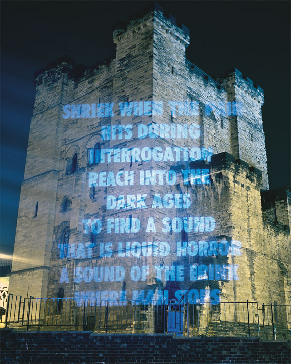
ART 21 Artist 1: Jenny Holzer, born in Gallipolis, Ohio, 1950 A.D / C.E. Much of her works, akin to Wodiczko's, projects the perspective of others on gargantuan monuments as well. However, rather than an actual video, Jenny uses texts for us audiences to read, though all of it has been anonymously written about political and social issues. Who wrote these?
In any case, I discovered and noticed that some of it was mundane and overused, however I did learn that common people of the daily life had written it, so it's easily relating even to me. The intention to this was to invoke a strong sympathy and ease of understanding, and it does. With the opinions and statements provoked on massive buildings, it's easy to notice, and they actually create the notion of citizens shrieking & howling their concerns at governments, big businesses, industries, and many magnitudes of incorporation & franchises. They are not only explicit, but excellent on the eyes. That way, their text can correlate and force vision on large structures, that of which is strikingly astonishing.
Images of her works are shown here:


ART 21 Artist 2: Krzysztof Wodiczko, who was born in Warsaw, Poland, 1943 C.E / A.D. He later then moved to the United States, and now resided in NY and MA (Massachusetts). Known for his installations & performance piece where he projects recording of people telling personal stores on huge monuments, often times, the stories are about gang-related violence and/or losing loved ones due to mass political situations and outbreak. Wodiczko desires for his works of art to remind people that the great-and-powerful monuments we gaze on a daily basis are relatively hiding the horrific iceburg-bottom of civilization and society entirely.
That being said, I find his works to be nothing new in the general theme of things, but it's still highly awe-inspiring due to the unique way he pulls it off. Even though some of his piece are respectfully old, the concept is timeless in essence. Even with the projectors, holograph devices, and newer technology we can represent his works with, the effects are always ever changing in all the better ways with the same "monster" formed by the ultra-real nightmare we call society. We could very well be in WWIII + Nuclear Wars on crack, combined soon!!
Here are images of his various works:


excellent post!
ReplyDeleteLove how thourough you are with your post. This gives your readers so much room to give you advice. The very first picture you posted is amazing. I love that one. The way the water is reflecting and the letters perfectly fit acorss the page. The black and white is a great value and tone for this. The only thing that I would recomend changing on most of your pictures is the font. It looks like the Nike add font "Just Do it" and what not, but maybe that it what you are going for?
ReplyDelete